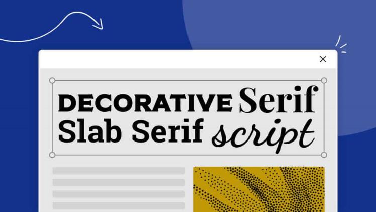
When it comes to typography, the choices are endless. There are dozens of typeface categories, each with their own unique style and characteristics. One such category is the slab serif typeface, which is known for its bold, blocky serifs that project a strong and confident aesthetic.
The slab serif typeface, also known as “Egyptian,” originated in the early 19th century as a way to create bold and attention-grabbing typography for advertising and display purposes. The typeface features thick, rectangular serifs that extend from the letterforms, giving them a bold and sturdy appearance. The strokes are usually uniform in width, creating a geometric and modern feel.
One of the most distinctive features of slab serif typefaces is their versatility. They can be used in a variety of settings, from advertising and branding to editorial and web design. The bold and striking appearance of slab serif fonts makes them ideal for headlines and titles, while their legibility and clarity also make them suitable for body text. The typeface is commonly used in newspapers and magazines, as well as on websites and in user interfaces.
Some popular examples of slab serif typefaces include Rockwell, Clarendon, and Sentinel. Rockwell, which was designed in the 1930s, features a bold and chunky appearance that’s perfect for headlines and titles. Clarendon, on the other hand, has a more traditional look with its sharp serifs and elegant curves. Sentinel, which was designed in the 21st century, is a modern take on the slab serif with its clean lines and geometric forms.
In addition to their aesthetic appeal, slab serif typefaces also have practical benefits. Their thick and sturdy serifs make them highly legible, even at smaller sizes. This makes them a popular choice for print materials, such as books and newspapers, where readability is essential. Slab serif fonts are also highly visible, making them ideal for outdoor advertising and signage.
When using slab serif typefaces, it’s important to consider the context and purpose of the design. While they can be highly effective for headlines and titles, slab serif fonts may not be suitable for every design project. Their bold and assertive appearance may not be appropriate for more subdued or delicate designs, where a more elegant and refined typeface might be a better fit.
Another factor to consider when using slab serif typefaces is their pairing with other fonts. Slab serif fonts can be paired with sans-serif or serif fonts, depending on the design and the intended effect. For example, pairing a slab serif headline with a sans-serif body text can create a strong contrast and emphasize the importance of the headline. Pairing slab serif fonts with other slab serifs can also create a cohesive and impactful design.
In conclusion, the slab serif typeface is a versatile and timeless choice for designers. With its bold and striking appearance, it can grab the attention of the viewer and convey a sense of strength and confidence. Its legibility and clarity also make it suitable for a wide range of design projects, from print materials to digital interfaces. By considering the context and purpose of the design, as well as the pairing with other fonts, designers can harness the power of the slab serif typeface to create impactful and memorable designs.

